


Shop the Products We Actually Use & Recommend
or jump right to our tips on…
Art Hanging Made Easy
How to hang it, group it, and make it feel like you

Height matters. A good rule of thumb: hang most art so the center of the piece is 60" from the floor; that’s typical standing eye level. Over mantels or furniture, aim for 3.5–4 inches above the top edge. Or eyeball it: the goal is for everything on the wall to feel part of the same visual “band” as you scan the room.
Have a small piece? Group it. Tiny art can get lost. Group smaller pieces together so they read as one larger visual moment. Keep spacing tight, about 2–3 inches apart.
Gallery wall? Start with the anchor. Begin with the biggest piece (or a strong pairing) and place it where it looks great on its own. Build outward from there, like a constellation.
Mix shapes and textures. Don’t just do rectangles. Add a round shape (like a plate, basket, or circular mirror) for contrast. Mix framed art with textiles, photos, or 3D objects for texture and depth.
Make it personal. Great art doesn’t have to be fancy and you don’t have to limit yourself to paintings and prints. Frame a letter from your grandmother or a note from your kid. A child's early drawing. A favorite black-and-white photo strip. A vintage postcard from your favorite vacation spot. A fortune cookie slip that still makes you smile. The more personal and offbeat, the more it tells your story. It should reflect your life and what brings you joy.
Great framing = instant upgrade. The difference between “kid art on the fridge” and “wow, that’s art” is almost always framing. Even the simplest or silliest piece — a note, a sketch, a postcard — can feel important when it’s treated with care and displayed with intention. We love a simple, wooden gallery frame in white, wood tone, or black.
Don’t skip the mat. A mat creates breathing room around the piece and makes even humble art feel elevated. White or off-white is timeless, but don’t be afraid of a colored mat that complements your palette. Oversized mats — especially on small or sentimental pieces — make things feel artful, curated, and full of intention.
Tip for parents: Treat your kids’ art like real art. Frame one special piece from each year and build a rotating gallery. Mix it in with other “grown-up” art to elevate both. It’s fun, personal, and gives their creativity pride of place.
Find some of MKW’s favorite frames (plus a few art prints) here.
Paint Tips That Stick
Our favorite colors, how to test them, and why Sheen matters

Test it right. The ideal is to paint swatches directly on multiple walls in the room and then observe them at different times of day for several days since your lighting changes everything. If you’re more adventurous, peel-and-stick paint samples from Samplize work though we find sometimes the colors are a little inaccurate. Backdrop offers their own peel-and-stick samples which is awesome and makes using them easy.
Farrow & Ball is our love language. Their curated palette makes it hard to go wrong, and at $35, their fan deck is a worthy investment for anyone diving into paint selection. When MKW first saw their color palette, she initially thought it was too muted for her taste, but turns out their colors are pretty impeccable, even for the most vibrant color lovers. Match their colors at a local paint store for a budget-friendly version.
Sheen = durability. The higher the sheen, the more lacquer in the paint, which means greater wipeability and durability, especially helpful in homes with kids, pets, or adults who bump into walls (so, everyone). We lean higher on sheen than most designers because real life is messy.
Walls (living spaces, bedrooms, etc.): Eggshell or satin
Bathroom walls: Satin (better moisture resistance than eggshell)
Ceilings: Flat — hides imperfections and doesn’t need to withstand impact
Trim (door and window casings, baseboards, crown): Semi-gloss for durability and subtle shine
Cabinetry and vanities: Semi-gloss
Our go-to colors:
Whites: Sherwin-Williams Pure White, Benjamin Moore White Dove
Neutrals that aren’t gray (even tan can be punchy!): Farrow & Ball Slipper Satin, Farrow & Ball Schoolhouse White, Farrow & Ball London Stone
Black / charcoal gray with a hint of navy: F&B Railings
Yellows: Farrow & Ball Babouche, Farrow & Ball India Yellow, Backdrop Stardust
Greens: Farrow & Ball Calke Green, Farrow & Ball Breakfast Room Green, Farrow & Ball Teresa’s Green
Blues: Farrow & Ball Stiffkey Blue, Farrow & Ball Dix Blue, Farrow & Ball Borrowed Light, Farrow & Ball Oval Room Blue, Backdrop Blue Is the Coolest Color
Pinks: Farrow & Ball Setting Plaster, Farrow & Ball Calamine, Farrow & Ball Tailor Tack, Backdrop Harajuku Morning
Purples: Farrow & Ball Peignoir, Backdrop Gin Blossoms, Benjamin Moore Twilight Magenta
surface styling 101
What to put on your coffee table, shelves, and side tables

Start with a clean slate. Clear everything off the surface. Yep, everything. You’ll get better results when you style from scratch, even if most of the items go right back on.
Know your function first. What does this surface need to do? Let the function dictate the footprint.
Coffee table → leave space for drinks and remotes
Nightstand → lamp, book, maybe a dish
Kitchen island → maybe just a single, beautiful fruit bowl and leave the rest open for prep
Follow the rule of 3s (or 5s). Group items in odd numbers; usually 3 is perfect. Vary the height, shape, and texture within each group:
Example: a lamp (tall), stacked books (flat), and a ceramic bowl (sculptural)
Another: a tray (base), stack of books (medium), and a small plant or dish (on top)
Layer like a stylist. This layering gives you that collected-but-considered look.
Start big: trays, books, a large vase. These are the anchors.
Add medium: bowls, plants (something organic and alive is always awesome, especially when using a lot of color and pattern)
Top with small: a small dish, heirlooms, oddities, tchotchkes
Mix textures. A rattan tray + stack of 2-3 books + a glossy bowl? That’s the good stuff. Aim for contrast: smooth with rough, shiny with matte, soft with hard. It adds depth even when the palette is neutral.
Books are your best friend. Use them to anchor groupings, add height, or fill negative space. Stack 3–5 horizontally. Let vertical stacks lean against a frame or object. Pop a dish, plant, or tiny tchotchke on top of a stack.
Bonus: Don’t overfill. Leave breathing room. Every item should feel like it belongs, not just like it needed a spot to land.
Mixing Color & Pattern
Joyful and layered, but never chaotic. Here’s how to pull it off.

Start with one piece you love. Find one patterned or colorful item — a rug, a throw pillow, a piece of art, even a dress you adore — and build from there. This gives you a defined palette to repeat across the room.
Repeat your colors on purpose. To create cohesion, make sure the main colors in your “inspiration piece” show up at least two more times in the space. If your rug has navy, ochre, and peach, try navy curtains, an ochre pillow, and peach-toned art. Repetition = visual harmony.
Organic textures create balance. We use a lot of natural textures like cane, rattans, natural-colored linen fabrics, and stained woods because their organic finishes balance out the use of color and pattern without making things fall flat (as can happen if you just use a bunch of white alongside a boat load of color and pattern).
Balance patterns with solids. For every busy or bold element (like a floral pillow or striped bench), balance it with solids: a plain linen curtain, a neutral rug, a solid-color sofa. Solids give the eye a place to rest and keep things from feeling chaotic.
Use a mix of pattern scale. Pair one large-scale pattern (like a big floral or geometric print) with a small one (like a pinstripe or dotted texture). Avoid using all large or all tiny patterns. They’ll either overwhelm or disappear.
Stick to 2–3 patterns per room. More than that can start to feel noisy unless you're intentionally layering like a maximalist. A good formula: one big hero pattern, one smaller accent pattern, and one subtle textural or tone-on-tone print.
Texture is your secret weapon. Even solids can feel layered when they include varied textures: a velvet chair next to a linen pillow and a woven basket is magic. Texture adds depth and warmth without extra visual clutter.
Test it all in your space. Tape up fabric swatches on the sofa. Drape a sample over the bed. Put that tile or wallpaper sample next to your countertop. If something feels “off,” it usually is. Trust your gut and try another combo.
Need an easy place to start? Try this:
Rug with a pattern (medium scale)
Solid-color sofa
Patterned throw pillows (in a different scale than the rug)
Neutral curtains or textured Roman shades
Artwork that repeats a few key colors
drapes done right
Choosing the right length, style, and placement

Yes, get them even if you have blinds or shades. We rarely use drapes for function; we rely on wooden blinds or woven shades for that. The drapes are purely a decorative touch that elevates the room and adds sophistication.
No, they won’t block your light. Not if you hang them right. Even if you already have blinds or shades for function, drapes are what make a room feel complete. They add softness, height, texture, and warmth, even when they stay open all the time. We like to extend the drapery rod and the drapes a solid 12-18” past the end of the window to ensure they’re covering the wall rather than blocking light.
Custom drapes are amazing and very, very expensive. If you’ve got the budget, custom drapes are amazing, especially in a bold, colorful fabric. The Shade Store is a favorite (ask for Melinda in the Nashville location). Want to splurge on one room only? Make it the main living space. That’s where it makes the biggest impact.
Off-the-shelf works just fine. You can absolutely get a great look with ready-made panels, and Target, IKEA, and Anthropologie are all great places to find them.
But semi-custom has become our sweet spot: Vendors like Pepper Home and even Spoonflower are making it possible to have higher-end looking drapes at a much more accessible price point. While Pepper Home’s color palette is much softer and more pastel than we tend to go for, the cost savings compared to custom is worth it for the quality, so we tend to use them in almost every project.
Hot tip: Always check if the panels are sold as singles or pairs. Nothing like opening the box and realizing you only bought half a window’s worth. And when you buy the rods, don’t forget to buy rings, too.
Hang them high and wide. Mount the rod close to the ceiling or crown molding (not just above the window) to draw the eye up and let in more light. And your panels should just kiss the floor, no highwaters, no puddles.
Use rings, not rod pockets. Hanging drapes on rings (with clips or drapery pins) gives a cleaner, more tailored look. We never use the rod pocket — it reads too country — and we don’t do drapes with grommets, either.
Choose the right rod color. We look at the other hardware in the room (door knobs and hinges primarily, but also cabinet hardware) to tie it all together; 2 different metal hardware finishes in a room are fine, but we try to avoid 3 or more competing metal finishes. Black rods are a safe choice 90% of the time, though we also sometimes do brass.
Go wide when placing rings on sides of brackets. Once the rods are up, we usually stack 5–6 rings outside the bracket and 3–4 inside. This keeps the bulk of fabric on the wall (not the window), maximizing natural light while still framing the opening beautifully.
Budget-friendly hardware tip: IKEA’s Bekrafta rod set is a simple, clean option; just make sure to get the combo set with brackets included, and don’t forget the rings.
Wallpaper changes everything
Where to use it, how to choose it, and why it’s worth the commitment (and the $$$)
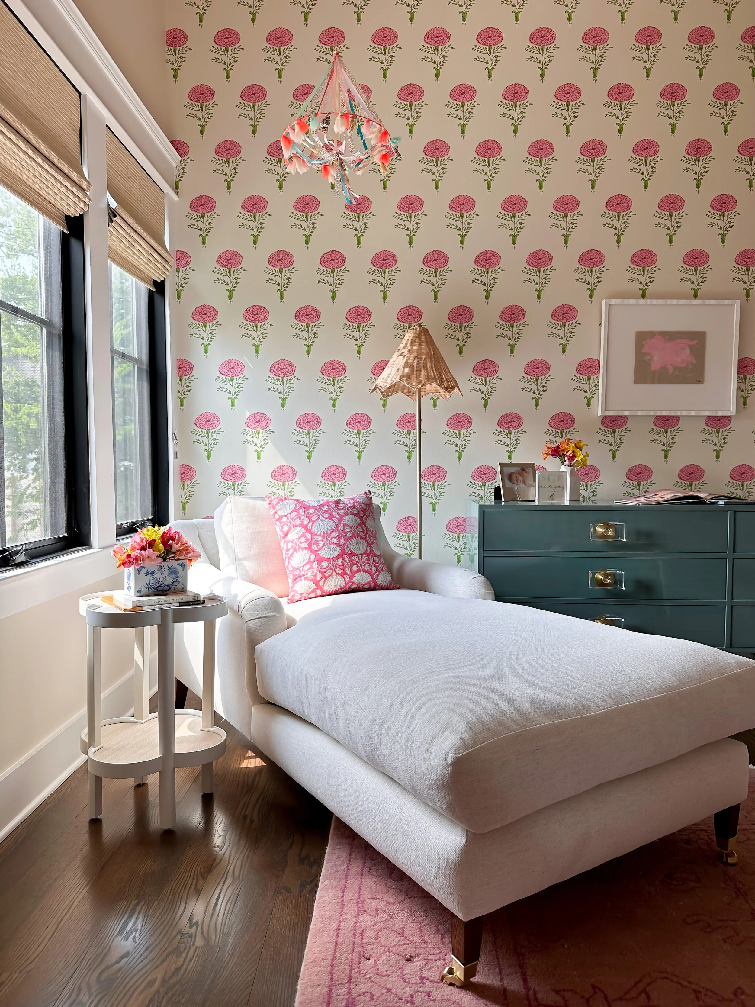
Wallpaper changes everything. Whether it’s one bold accent wall or a full room wrap, wallpaper instantly brings dimension, personality, and polish. Even a small powder room can feel like a jewel box with the right pattern.
Start with the spot that needs a spark. Hallways, powder rooms, entryways, dining rooms, ceilings — anywhere that feels forgettable can become memorable. And it doesn’t always need to be bold or loud; even a subtle texture or tone-on-tone print can add depth. Small, pass-through spaces where you don’t spend much time — hallways and powder rooms — tend to be especially great spots if you’re feeling a little wallpaper-shy.
Not just for walls. Think outside the box: try wallpapering a ceiling, the backs of bookshelves, or a kid’s closet nook. It’s one of our favorite tricks for adding surprise and joy.
Choose what makes you smile. Don’t overthink it. If a pattern makes you light up, it’s probably the right one. Want something you won’t tire of? Look for colors you already gravitate toward in your home and wardrobe.
Scale matters. Big room? You can handle a big print. Small room? You still can do a bold pattern; it’ll read like a vibe, not a mistake. What matters most is balance: pair bold paper with simpler furniture and art, or keep everything else minimal to let the wallpaper lead.
Don't be afraid to go ceiling-to-baseboard. Wrapping the whole room (versus just one wall) creates a cocoon-like feel. It makes even vibrant patterns feel more intentional, less jarring. And in a room with slanted ceilings, it tends to be important to wallpaper the angled parts of the ceiling as well as the flat part of the ceiling. Otherwise you end up with a room that looks like your wallpaper hanger quit mid-job.
Some of our favorite wallpapers are linked here, plus we regularly source from these vendors:
Wallshoppe (not your grandma’s wallpaper, more modern, playful, and fun options)
Schumacher (more traditional-leaning but a great mix of some modern and graphic, too)
Sandberg (soft, romantic, European)
The Pattern Collective
Removable vs traditional: For the smoothest look and longest-lasting results, traditional paper + professional install wins every time. But if you’re renting, peel-and-stick has come a long way and is a great way to bring in some color and pattern.
Pro tip: Always, always order samples and see the paper in person before you place your order; this is especially important for understanding scale of the pattern before you commit. Tape the samples up for a few days. Lighting, room size, and surrounding finishes all affect how a pattern feels. Trust your gut: if it feels “off,” it probably is, and if it delights you endlessly, it’s probably going to be great even if you’re a bit nervous.
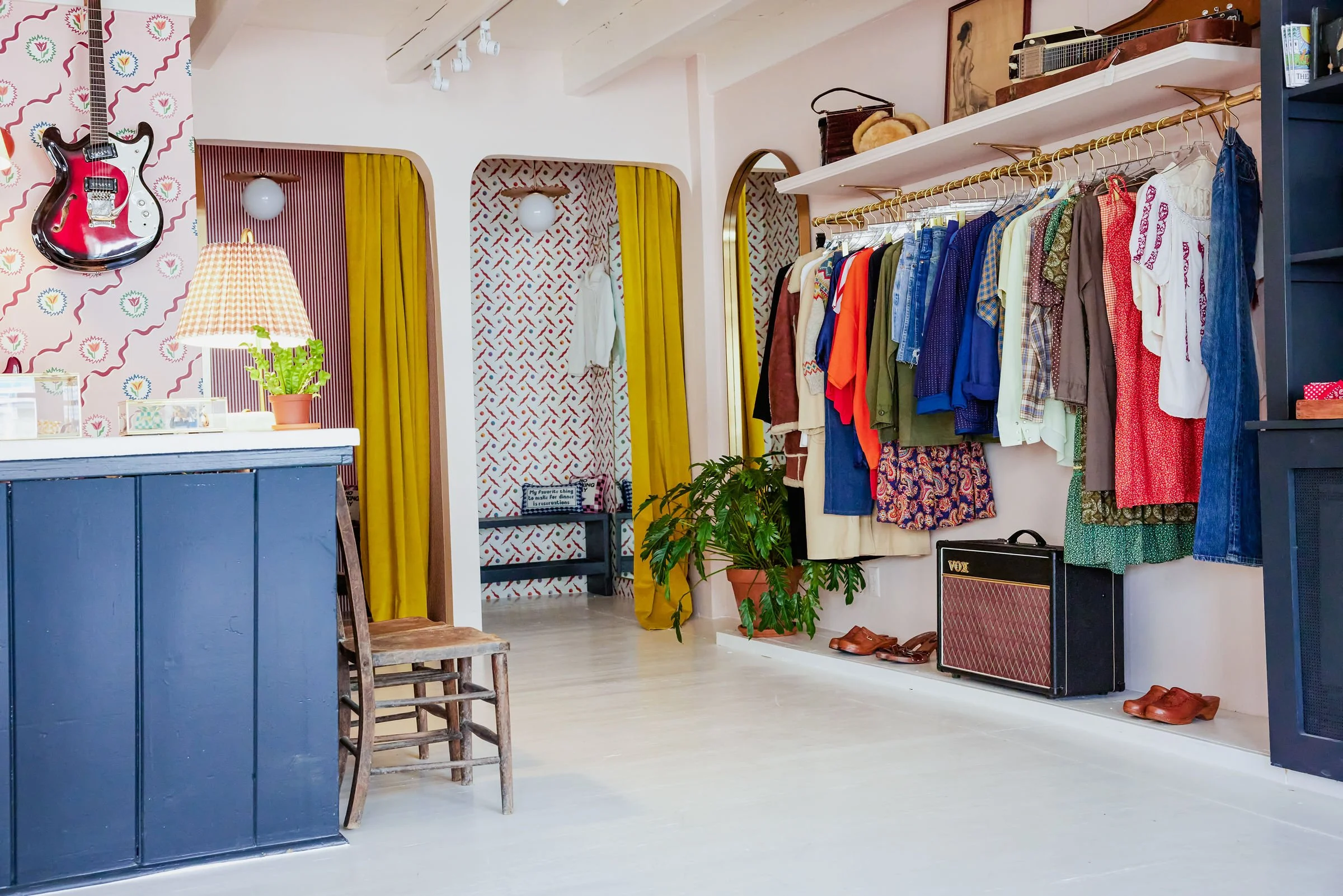
design around what represents you
How to incorporate hobbies, mementos, and kid chaos into a home that still feels pulled together

Honor what you love. Whether it’s music, martial arts, or motherhood, look for ways to turn personal items into design moments. Mount a ukulele to the wall. Display a jiu-jitsu belt knotted like it’s being worn. Put a beloved baseball in a clear acrylic box and set it on a stack of books.
Mix high with low. One of the secrets to making sentimental or kid-made pieces look good is to treat them like “real” design. Frame a child’s drawing beautifully and tuck it into a gallery wall. Style a wonky clay dog sculpture proudly on your living room mantel. Juxtapose a painted pasta necklace with polished brass or vintage pottery. The tension makes it work.
Use toys as styling objects. If they’re pretty, they’re fair game. A wooden truck or block set can live on a shelf like any other decorative item. Stick a toy on a stack of books or tuck it into a styled bookshelf. You’re not pretending kids don’t live here; you’re celebrating it.
Create structure with baskets and consoles. Console tables behind a sofa are great for corralling clutter, especially if they have a bottom shelf. Add a few good-looking baskets underneath (felt so they don’t scratch the table or floor) for toys, art supplies, or sports gear. The visual calm of a consistent container goes a long way.
Let real life be visible. The Barbies on the bathroom floor, the costumes draped over chairs — they’re annoying, sure. But one day you’ll miss these signs of life. Design your home to handle the mess (durable surfaces, forgiving fabrics), but also to welcome it. A lived-in space is a loved-in space.
upgrade your lampshades (& yes you need lamps even if your overhead lighting gives good light)
An easy upgrade that instantly elevates any rooM

Every room needs lamps. Even if your overhead lighting is technically “bright enough,” relying solely on ceiling fixtures makes a room feel flat. Lamps add warmth, dimension, and ambiance, and they bring light down to human level. Always include at least one lamp per room (ideally two or three) for lighting that actually makes people want to linger.
Swap the shade, keep the base. It’s the easiest styling trick in the book. If your lamp base is solid but the shade feels blah, trade it out for something with character; pleated fabric, rattan, color-blocked linen, or even a patterned paper shade can breathe new life into a tired lamp.
Try a pop of color or pattern. A red pleated shade on a brass lamp? Yes please. A block-printed floral on a classic ceramic base? That’s the good stuff. Lampshades are low-stakes places to take a risk. Just make sure the shade picks up a color already found elsewhere in the room so it feels intentional, not random.
Consider scale and proportion. If the shade is too small, it’ll look top-heavy. Too big, and it overwhelms the base. A general rule of thumb: the shade should be about ⅔ the height of the base and wide enough to cover the lamp’s hardware.
Mind the bulb. Swap your harsh white bulbs for warm white ones (2700K is a safe bet). And if your new shade is colored or heavily patterned, test it on the lamp before committing as it can tint the light in surprising ways.
Find some of our very favorite lamps here. Pooky is hands-down the best one-stop shop for fun lamps and lampshades. Anthropologie is a great spot for shades, and don’t overlook Target for a low-cost lamp base (then go get a fun shade from Pooky or Anthropologie!)
holiday decor that feels like you
Festive, joyful, and not a storage nightmare

Our approach to holiday decorating is the same as our approach to everything else: keep it joyful, keep it manageable, and make it yours. Here’s how MKW does it at her own house — with kids, chaos, and a lot of color.
Start with the tree. We do a live tree every year with classic C7 multi-colored lights (the big ones — yes, please). If my kids will let me, I’ll wrap one or two wide wired ribbons around the tree in a fun color (like pink), but mostly, we dive right into the ornaments. Ours are a hodge-podge of collected and handmade — heavy on the preschool projects — and yes, the kids hang them in clumps and random clusters. I wouldn’t have it any other way. Our tree topper is 2 parts: a star I folded out of aluminum foil the year my husband and I got our first Christmas tree together, and a paper towel roll our oldest child painted and decorated with pom-poms with his beloved nanny (shout out to Kaylin) when he was 2.
Stockings, but make them work for your space. Instead of hanging stockings from the mantle (which gets crowded in our house with the tree nearby), I hang ours from the open shelving in our kitchen. The visual balance is better, and it gives them pride of place. We have a mixture of stockings from Furbish, St. Frank, and Schoolhouse, all bought during Black Friday sales.
Go green (literally). Every year, I buy fresh wreaths and greenery from Trader Joe’s — inexpensive and no storage bins required. The greenery is the only other holiday decor I do alongside the tree and stockings, and it keeps things more manageable, while also looking elevated and not like a madhouse of seasonal tchotcke chaos. I hang a wreath on our front door, one over our big dining room window, and another over the kitchen shelving. If I’m feeling ambitious, I’ll swag fresh garland along the stairwell banister using fishing wire and maybe pop some small wreaths over mirrors with neon pink or red-and-white-striped ribbon. I skip the embellishments mixed into the wreaths and greenery; simple greenery is cheerful, classic, and smells amazing. And come January, we do a backyard bonfire and toss in the wreaths — festive and cathartic.
Set the mood. For bonus holiday cheer, I keep a Thymes Frasier Fir oil diffuser in the bathroom all season long. It’s the smell of December.
Setting the holiday table, no red-and-green linens required. We like a festive table that doesn’t require a separate set of dishes and linens just for one day a year. (For a maximalist, I’m a pretty big fan of simplicity.) Here’s our go-to formula:
Tablecloth + napkins. I use a patterned tablecloth I love year-round. Pair with cloth napkins in a coordinating or mixed pattern. We rotate through a small stash and sometimes repeat the same setup multiple years in a row. (If it works, it works.)
Flowers + fruit. I grab 3 petite bouquets from the Whole Foods floral section (they usually have a little stand of mini bouquets that are just $10 or $15 each) and drop them in julep cups when I get home. You can use jam jars or whatever small vases you have. Then I scatter fresh clementines or satsumas down the center of the table, ideally the kind with green leaves still attached. Instant holiday charm.
Candlelight. I have a couple candelabras that sit on our dining table year-round (you can find a pair at an estate sale or thrift shop) with taper candles in a fun color (usually pink, unsurprisingly). Just make sure they’re unscented so they don’t compete with the food. I love taper candles for instant ambiance and a sense of magic, regardless of whether it’s a special holiday meal or pizza delivery night.
Everyday meets heirloom. Some years we use the silver and china passed down from my grandmother, sometimes it’s our everyday dishes and flatware. Both work beautifully. We also use our Astier de Villatte serving pieces, which we received as wedding gifts — they feel extra special, but not so precious that we won’t use them.
our go-to vendors
the people we call again and again
Designing a home takes a village. These are the trusted pros we call again and again — the kind of folks who show up on time, care about the details, and help bring our designs to life. Save this list, share it with a friend, or hand it over to your GC.
Handyman crew: To-Do List Pros – Elevated, white-glove handyman service. Great for all the punch list items you’ve been putting off and / or need to get done before your project wraps. You’ll be amazed what they can tackle.
Paint (interior, exterior, and everything else): Harpeth Painting – Meticulous prep and beautiful finishes. Worth every penny.
General Contractors
Reliant Construction Group – Our go-to for larger projects.
Mac of All Trades – Perfect for small to mid-size jobs that need real skill and flexibility. Call Steve at 615-417-4241.
Custom window treatments: The Shade Store – Ask for Melinda at the Nashville showroom. They offer expert service, beautiful materials, and excellent customer support.
Framing that elevates: Hanging Around – Ask for Heather. They do gorgeous custom framing and can even enlarge your kid’s artwork for a big, bold impact.
Exterior woodwork: Dave Mansfield @ The Porch Company – If you need porches, columns, or exterior trim done well, he’s your guy.
Wallpaper
Custom design: New Hat – Incredible bespoke pattern design if you're ready to invest in a custom wallpaper you’ll never see anywhere else.
Installers: Ron (931-626-8251) or Dwayne (615-207-5091) – Call either and you’ll be in good hands.
Appliances: Cenwood Appliance – Ask for Magen. She knows her stuff and makes the selection process smooth and stress-free.
Electrician: Dodd Electric – Ask for Tommy. Super-skilled, detail-oriented, and kind.
Kitchen & bath plumbing fixtures: PDI Kitchen & Bath – Ask for Libby. A one-stop shop for everything from faucets to tubs, with expert guidance along the way.